.png)
Manulife: Storefront
.png)
My Role: Product Analyst
Timeline: 2 months (Oct 2024 - Nov 2024)
Methods: Competitor Analysis | Heuristic Evaluations | Journey Mapping
Process
RESEARCH
ANALYSIS
Discovery Planning
Competitor Benchmarking
Internal Audit
Heuristic Evaluation
Journey Mapping
DELIVERY
Deliverables
Proposal
REFLECTION
Next Steps
Project Takeaways
The Challenge
With a long-standing global presence, Manulife had accumulated hundreds of digital properties managed independently across regions and business units. This fragmentation made it difficult to maintain a consistent brand and led to duplicated work, servicing inefficiencies, and a disjointed user experience.
One of the biggest challenges was building urgency around this issue. Many teams were focused on their individual products, making it hard to align on a shared vision for change. As an intern on the digital transformation team, I supported early discovery efforts that helped surface these pain points and shaped a proposal to drive alignment across the organization.
.png)
Customer Expectations:
-
Relationship is with Manulife, not at the product level
Manulife Today:
-
Customers hold individual relationships with each product, forcing them to determine and integrate their own journey
Most Multi-Product Companies:
-
One cohesive customer experience across multiple holdings
Research
DISCOVERY PLANNING
We began by framing the scope of the project: assessing how Manulife’s mass amount of digital properties could be unified to create a more cohesive, brand-level customer experience.
I collaborated across business units to align on the core discovery questions:
-
Where are the biggest navigation pain points?
-
Where are redundant servicing tasks hurting the user experience?
-
What systems or components could be consolidated?
This early-phase planning set the foundation for a structured audit and clear prioritization as we coordinated across Segments to evolve our digital properties.
FROM
TO
Many 'front doors' to access our products (XXX+ websites/apps)
Different designs, layouts, navigation menus across products
Customers repeat common processes (e.g., change address, update bank info, view documents) separately for each product
-
More integrated customer experience per market, where warranted
-
Login, landing pages, and experience that reflect customer's relationship with Manulife
-
One similar look and feel reflecting our global brand
-
Common navigation across all properties
-
Common customer servicing submitted once and applied to all products / BUs in market (and, built once and reused to simplify UX and save cost
COMPETITOR BENCHMARKING
To understand how Manulife could improve its fragmented digital ecosystem, we benchmarked major competitors across the insurance and financial sectors, including Sun Life, TD, RBC, and Rogers. We looked at how these companies structure their digital platforms, deliver cohesive experiences, and simplify customer servicing.
Competitor
Strengths
Weaknesses

Unified digital login across products; consistent design system; single point to update personal info across holdings.
Limited personalization; slower rollout of advanced self-serve tools.

Seamless banking + insurance integration; strong mobile UX; well-established brand trust.
Occasional inconsistency between mobile and web interfaces.

Centralized dashboard for multiple accounts; excellent cross-selling experience; high digital adoption rates.
Navigation can become dense with too many features on one screen.

One-stop account management; address changes apply across services; strong digital servicing metrics.
Backend system lags despite front-end consistency.
Internal Audit
As part of the discovery phase, we collaborated across teams to conduct a cross-segment audit of Manulife’s digital ecosystem, spanning public websites, secure portals, and mobile apps. While I cannot disclose the exact figures, the audit surfaced a surprisingly high number of individual digital properties spread across business units, which were far more than expected for a single brand.
I contributed to this phase by helping assess cross-segment patterns and opportunities, supporting the foundational analysis that informed the broader consolidation strategy.
Our audit focused on:
-
Quantifying the digital footprint to understand just how many platforms, sites, and domains were active
-
Identifying redundancies, overlaps, and inconsistencies in servicing flows and design patterns
-
Calculating potential consolidation opportunities, which would significantly reduce the number of supported systems and improve operational efficiency
These findings shaped the foundation of the consolidation roadmap, aiming to simplify the ecosystem, enhance the customer experience, and generate substantial cost savings.
**FIGURES REDACTED FOR CONFIDENTIALITY
FROM
TO TARGET END STATE
XX Public Websites
~X Public Websites
Key Converged Public Sites per Market
Public storefronts for prospects, customers, and all other stakeholders
XX Secure Websites
~X Secure Websites
Key Converged Secure Sites per Market
Integrated experience for individual insurance, wealth, group benefits/retirement
XX Mobile Apps
~X Mobile Apps
Key Converged Mobile App per Market
Integrated experience for individual insurance, wealth, group benefits/retirement
Analysis
HEURISTIC EVALUATION
Through heuristic evaluation, we uncovered how fragmented design choices across Manulife’s digital ecosystem were directly impacting user trust, task completion, and overall satisfaction.
Each product and region presented a slightly different face to the customer, with inconsistent patterns, navigation, and branding that forced users to relearn interactions over and over.


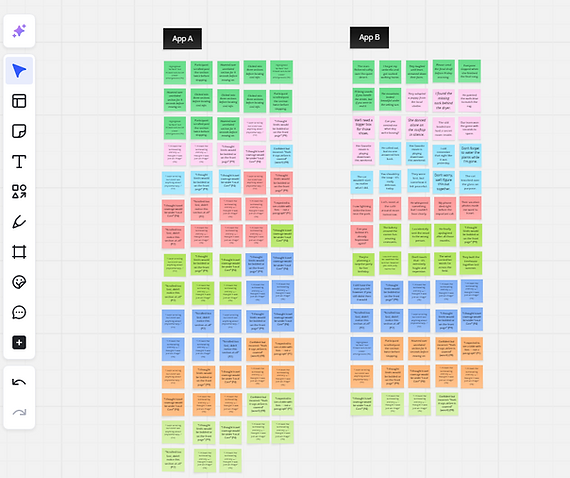
To explore these inconsistencies, we ran side-by-side evaluations of digital properties across markets. For example, we compared two apps serving different regions to reveal differences in layout, flows, and design standard adherence.
We also reviewed login screens and navigation patterns across three major markets:
US: Different login look/feel


Asia: Different navigation and login


Canada: Different navigation


By identifying these friction points, the evaluation helped demonstrate the urgent need for a unified design system that could streamline experiences, build brand consistency, and reduce cognitive load for customers.
Definition: Common Design system
A common architecture and set of components and templates for websites and apps that provide simplicity, consistency, and faster development.
JOURNEY MAPPING
To understand the true impact of Manulife’s fragmented digital ecosystem, I conducted a task-based walkthrough of a real servicing scenario: updating a home address across multiple Manulife products. I mapped out each step the customer would need to take, noting repeated logins, unclear flows, and high-effort tasks.
This method helped surface the complexity and inconsistency of the current servicing experience, especially for customers who hold multiple products.

A single task required over 26 clicks, three separate processes, and even ended in a faxed form. Each product operated in a silo, forcing the customer to repeat actions and navigate disjointed interfaces.
To benchmark the experience, I mapped the same task on a competitor platform. Sun Life allowed the address update to be completed across all products in just 5 clicks using a single sign-on and unified flow.

By comparing both journeys, I was able to illustrate how disconnected systems increase user effort and frustration. These findings supported the case for a unified servicing model built on consistency, reuse, and shared infrastructure.
Delivery
DELIVERABLES
We translated our research into clear, visual assets that highlighted patterns across platforms and regions. Instead of raw data, we focused on delivering synthesized insights through journey maps, heuristic grids, and competitor comparisons.
Each artifact was designed to be digestible, actionable, and aligned with stakeholder needs. The goal was to tell a story that made the problem real, supported alignment, and set the stage for decision-making.
PROPOSAL
We compiled our findings into a focused proposal that surfaced the most urgent usability issues and opportunities. The content drew from real journeys, inconsistent flows, and gaps across digital properties.
The proposal made a case for investment by showing the risk of staying fragmented and the potential of a unified design system. It helped stakeholders see the path forward and supported early buy-in for next-phase planning.
Reflection
NEXT STEPS
Following our discovery work, we outlined a roadmap to help guide cross-functional teams toward a more unified digital experience. This included aligning on key themes uncovered during the research, building a shared understanding across business units, and translating those insights into a proposal for long-term investment.
Our findings helped shape a multi-phase plan:
-
Consolidating scattered digital properties
-
Prioritizing high-impact experience gaps
-
Laying the groundwork for reusable design systems and servicing components
These next steps are now being used to inform business case development and drive conversations around funding, collaboration, and strategic alignment across regions.
PROJECT TAKEAWAYS
This project showed how foundational UX research can drive clarity and alignment across complex organizations. By stepping back to map journeys, evaluate usability, and compare competitors, we were able to surface issues that had long gone unnoticed due to siloed structures and fragmented ownership.
Key takeaways from this work include:
-
Fragmentation creates friction: Disconnected systems force users to repeat tasks, learn new patterns, and navigate uncertainty, all of which reduce trust and increase support needs.
-
Discovery drives alignment: Cross-platform evaluations helped teams connect the dots and recognize shared issues that couldn’t be solved in isolation.
-
Evidence earns buy-in: Visualizing customer struggles made the case for change more compelling than metrics alone. Research became a bridge between insight and action.