top of page
.png)
The Argus Group: Schedule of Benefits

My Role: UX Researcher
Timeline: 1 month (Jan 2024 - Feb 2024)
Methods: Usability Testing | Behavior Analysis | Affinity Mapping
Process
RESEARCH
Stakeholder Discovery
Session Planning
Recruitment Strategy
USER INTERVIEWS
Participants
Materials
Facilitation
ANALYSIS
Data Preparation
Affinity Mapping
Insight Synthesis
DELIVERY
Deliverables
Findings
REFLECTION
Next Steps
Project Takeaways
The Challenge
Insurance documents are dense and hard to navigate, especially when members need clear answers about health coverage.
At Argus, the Health Schedule of Benefits was meant to help members make confident, self-guided decisions. But the team noticed rising support calls, repeated confusion, and frequent requests for help with details that should have been clear.
We focused on one core question:
-
Do members understand this document, and how can we improve their ability to use it independently?
As part of the research team, I helped plan and run a usability study to identify where comprehension broke down and explore ways to make the document simpler and more intuitive for members facing important decisions.

Research
STAKEHOLDER DISCOVERY
Before usability testing, I supported discovery sessions with stakeholders from Benefits, Marketing, and Customer Experience. Together, we surfaced internal assumptions, member pain points, and priorities for success from both business and user perspectives.
I organized the input into a Miro board, clustering notes into themes like assumptions, quotes, and early hypotheses. This alignment helped the team pinpoint where comprehension might fail and shaped realistic user testing tasks.
Grounding the study in stakeholder concerns ensured the insights we gathered were relevant, actionable, and easier to prioritize.

SESSION PLANNING
I helped translate research goals into actionable sessions by shaping realistic tasks reflecting common user challenges, like checking eligibility or understanding approval rules, while avoiding leading language. I organized the task board in Miro, defining key behavioral signals (confusion, hesitation, frustration) and worked with the team to align on success criteria.
This led to a behavioral checklist capturing signs like backtracking, uncertainty, and excessive scrolling. Finally, I led affinity mapping, grouping observations by themes such as terminology gaps or category confusion, helping the team prioritize issues aligned with stakeholder needs.

I helped finalize 10 core tasks, balancing usability prompts with open-ended questions to capture both performance and reflection. These tasks probed areas like info findability, terminology gaps, and confidence using the document.

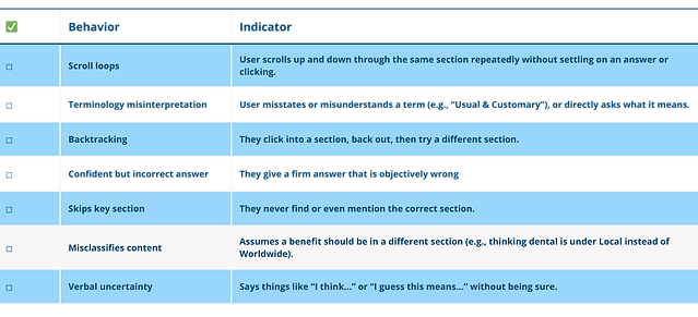
To keep sessions consistent, I co-created a behavioral checklist of key signals to track live, such as scroll loops, skipped sections, misinterpreted terms, and confidently wrong answers. As moderator, I relied on this to capture subtle behaviors in the moment without guessing or overinterpreting. It made post-session synthesis sharper, more objective, and easier to align across the team.
RECRUITMENT STRATEGY
To reflect how members actually use the Schedule of Benefits, we built our recruitment around real behavior and insurance experience, not idealized workflows. I helped define a participant matrix based on insurance familiarity, claims history, and platform usage, focusing on experience-driven variables rather than demographics.
%20(2).png)
User Interviews
PARTICIPANTS
To explore how people actually used the document, we conducted nine one-on-one interviews with real users. I supported recruitment by reviewing participant profiles and coordinating with the external vendor to ensure diverse perspectives.
We intentionally selected two key groups:
-
Health plan members who had used their benefits recently
-
Internal employees familiar with coverage questions and claim processes
Each hour-long session was held over Microsoft Teams or in person. I also handled the participant tracking sheet and organized logistics to keep the study aligned and on schedule.

MATERIALS
I designed the moderator script based on our final task list. Instead of using a rigid script, we used a loose session outline that moved through four phases:
-
Opening and consent
-
Task prompts
-
Open-ended reflection
-
Wrap-up
This gave moderators flexibility to adapt questions naturally, while ensuring consistency across sessions.

To support consistent note-taking, I also created an Excel-based session tracker.
Each participant had a dedicated sheet with structured columns to help moderators log:
-
Task # and Prompt – To guide moderators through the standardized flow
-
Outcome – To assess whether the participant succeeded in the task, partially succeeded (required help), or failed
-
Moderator Notes – To capture task-specific insights and reactions
-
Behavior Checklist – To mark observed behaviors (Provided below table as reference)
This setup helped reduce cognitive load during live sessions and made post-session synthesis much easier for the team.
FACILITATION
Each session paired a moderator to guide tasks and an observer to track behaviors and take notes. We used minimal intervention, avoiding guidance or correction to surface natural confusion. Real-time tracking captured behavioral signals in Excel, and we followed a consistent script and task order to ensure reliable data across all sessions.
.png)
ANALYSIS
DATA PREPARATION
After interviews, I helped launch the analysis by exporting session notes and tracking sheets from Excel. I organized the raw data: pulling participant quotes, tagging behaviors, and aligning notes to each task. I also standardized the note formatting with participant IDs and task numbers, making it easier to clean and import the data into Miro for team synthesis.
AFFINITY MAPPING
In Miro, I helped cluster insights across sessions by sorting sticky notes — quotes (blue), observations (green), and behaviors (pink) — and linking them to tasks for traceability. We then regrouped by theme, which revealed cross-cutting issues like terminology confusion and hesitation.
These patterns shaped the usability insights we delivered. By setting up and organizing the Miro board, I helped ensure clustering sessions stayed smooth and grounded in real participant behavior.

INSIGHT SYNTHESIS
After clustering in Miro, I helped organize the findings into three key deliverables:
-
Overarching Insights: Recurring issues with comprehension, confidence, and navigation
-
Actionable Recommendations: Targeted improvements to clarity, layout, or content
-
Visual Mockups: Annotated screenshots showing where users struggled and how fixes could help
I also drafted slide content, combining evidence (quotes, observations, behaviors) under each insight.
Delivery
DELIVERABLES
To communicate our findings, we created a stakeholder-facing slide deck as the main deliverable. I supported the presentation build by organizing quotes, visuals, and tagged evidence into structured sections that made insights digestible for cross-functional teams. We walked through it during a working session with members of the Benefits Review Committee, Marketing, and Digital teams.
FINDINGS
To ground our insights in real user experience, I took detailed notes on how participants reacted, both emotionally and cognitively, while navigating the document. Across nine interviews, I observed everything from hesitation and second-guessing to outright frustration.
These quotes helped humanize the usability breakdowns. They gave us context for where and why the document failed to support clarity, confidence, or autonomy. By surfacing this emotional feedback early, we were able to design recommendations that were not just functional but empathetic.
.png)

We distilled participant comments and behaviors into 6 usability themes, each tied to breakdowns in comprehension or decision-making, and paired those with 9 targeted recommendations to reduce friction and increase confidence.

To help bridge the gap between abstract themes and practical next steps, I supported the team in building annotated mockups that pinpointed exactly where users struggled in the Schedule of Benefits document. Each slide called out key participant quotes, behavioral indicators, and usability breakdowns, all visually marked on the document itself. This made the problems concrete, not conceptual.

These mockups became a powerful reference point during stakeholder discussions. Instead of just saying, “users got confused,” we could show exactly where and why. It gave cross-functional teams a shared foundation for prioritizing fixes and moving design conversations forward.
Reflection
Next Steps
With the first phase of usability testing complete, the next steps would focus on:
-
Iterating on recommendations to improve clarity, layout, and language in the Schedule of Benefits.
-
Conducting a follow-up round of usability testing to validate updates and ensure real improvements in member comprehension.
-
Preparing a final deliverable to hand off actionable insights and design recommendations to the product and policy teams.
Project Takeaways
Working on this project taught me the importance of flexibility and structure in research.
I learned how to:
-
Balance structure with adaptability. Even the best-planned sessions need adjustment when users take conversations in new directions.
-
Ground insights in real behavior. Observing participants firsthand revealed gaps we couldn’t have predicted from assumptions or documents alone.
-
Collaborate closely with stakeholders. Aligning early and often helped ensure that findings were meaningful and actionable for the business.
Most importantly, I saw how research can drive not just usability improvements, but also deeper empathy and trust between an organization and its users.
bottom of page